
Wedding Color Trends 2026 – Curated Palettes for Your Destination Wedding
Crafting Timeless Memories
Colors aren’t just decoration, they tell your story. As a destination wedding photographer, I’ve seen how color shapes emotion, rhythm, and memory. Whether you’re saying yes beneath Moroccan light, among Tuscan olive groves, or by the ocean in Tulum, your color palette sets the tone for everything.
This 2026 guide isn’t just about trends, it’s about timeless harmony. I’ve curated palettes inspired by real weddings, natural light, and iconic backdrops across the world. The goal? Help you find tones that feel like you — not just this year, but forever in your photos.
Want to see how it all comes together? Explore a real wedding in Tuscany →
The Power of Color in Storytelling
Timeless Wedding Color Combinations That Photograph Beautifully
When captured through the lens, color becomes more than just style, it becomes memory. Each tone carries emotion, and when chosen intentionally, your palette becomes the invisible thread that ties your wedding story together. I’ve seen how colors shift in the Tuscan sun, glow in Marrakech at golden hour, or soften against the coastal light of Tulum. These curated tones aren’t just trendy — they’re timeless, cinematic, and made to live beautifully in photographs.
Inspiration
Wedding Color Inspiration by Destination – Let the Location Speak
1. Let the Destination Speak
From the golden sunsets in Marrakech to the olive groves of Tuscany or the tropical air in Tulum — every place tells its own story. Use its natural palette as your foundation: earthy neutrals in Morocco, sun-faded terracotta in Italy, breezy ocean tones in Mexico. Your location isn’t just the setting. It’s part of the story.


2. Keep It Simple, Symbolic, and You
Stick to 2–3 core colors. Add accents only if they serve a feeling or cultural layer. Think of tones that hold meaning — a nod to heritage, a season, or a shared memory. Build moodboards and test them in daylight, not just on-screen. Because what looks pretty online might fall flat under real light.
3. Start with Emotion, Not Trends
Your color palette should feel like a reflection of you — not a Pinterest board. Ask yourself: What mood do you want your wedding to carry? Intimate and soft? Bold and cinematic? The tones you choose will shape how every moment is remembered through the lens. In 2026, authenticity matters more than trend lists.

.
MARAKKECH Color Code
#E8A944
#A03C3B
#DAC4A7
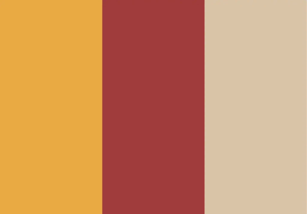
Saffron yellow, deep red and desert sand mirror the richness of Moroccan culture — from sunlit medina walls to traditional textiles. These colors bring warmth, depth and a sense of storytelling that fits perfectly into Marrakech’s soulful aesthetic.
TULUM Color Code
#DA8C7C
#E8DCCB
#B5C1A5
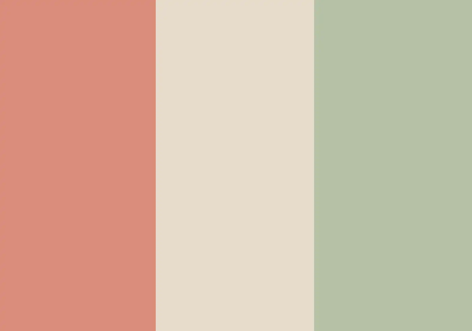
This palette blends soft beach tones with boho character. Dusty coral and sand beige reflect the sun-drenched coastlines of Tulum, while sage green adds an organic balance. Perfect for barefoot ceremonies, soft light and laid-back luxury.
TUSCANY Color Code
#CB6843
#8A9A5B
#FD7BF
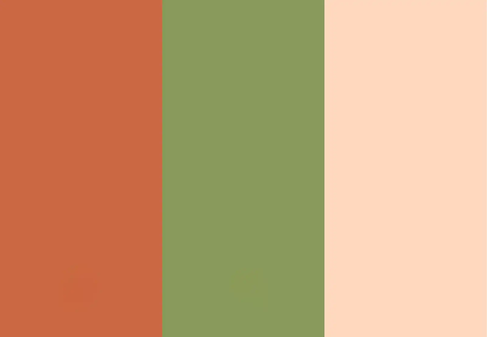
Terracotta, olive green and soft ivory capture the soul of Tuscany – warm, grounded and effortlessly elegant. These tones echo the natural textures of stone villas, rolling vineyards and golden sunsets, creating harmony between the landscape and your celebration.
MALLORCA Color Code
#F4B9A9
#A3A86B
#F7F5EF
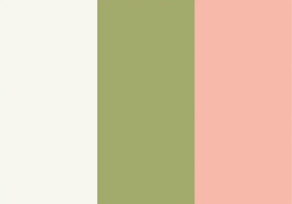
Peach, olive green and cream white are made for Mallorca’s soft, Mediterranean light. They feel fresh yet timeless, and reflect the island’s natural elegance — from blooming gardens to rustic fincas and warm stone terraces.
Bold colors can steal the stage. But weddings aren’t about loud. They’re about balance, light, and feeling. That’s why I gravitate toward soft, earthy tones — dusty coral, olive, sage, muted taupe. They blend effortlessly with natural light, whether it’s the golden haze in Tuscany, the desert air in Morocco, or ocean breeze on a Tulum coast.
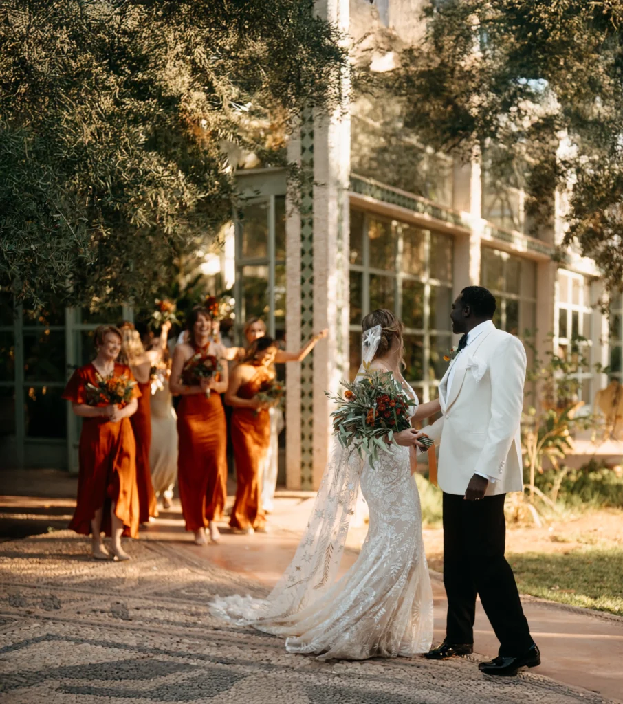
→ Discover the Marrakech 2026 Destination Wedding Guide

Color Code: #DFF90 #9EC691 #DFF5B5
How to Choose Your Wedding Color Palette
Choosing your wedding colors isn’t about trends, it’s about feeling.
Colors shape how your day is remembered: in light, in mood, in every captured moment.
Whether you’re planning a luxury wedding in Marrakech, a sunlit celebration in Tuscany, or a barefoot elopement in Tulum, your palette should reflect you. Not just your style, but your story.Earthy tones, pastels, or bold contrasts — they work, as long as they feel honest.
This 2026 guide helps you find colors that match your heart, your destination, and the atmosphere you want to create.
Need help bringing it all together? Let’s talk — I’ll help shape a color story that feels entirely like you